
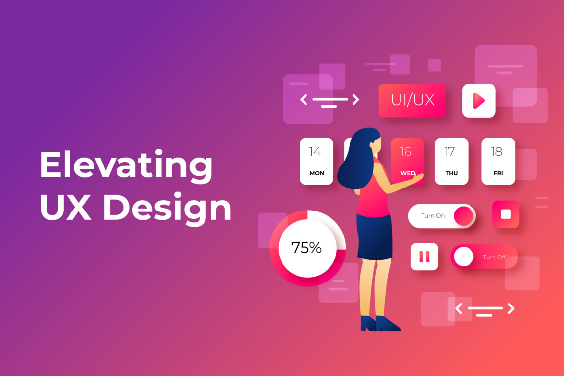
Given the fact that people are nowadays attached to mobile gadgets like their limbs, it is not strange that mobile first design is taking the central place in UX/ UI design. We know at Eternal HighTech that there is no experience which won’t be smooth, engaging through a phone, tablet or any other device. Introducing the Art of Mobile-First UX Design – How We Create Magical Mobile Interfaces that Engage Users and Deliver Success for Our Clients.
Eternal HighTech
The Mobile-First Revolution
Mobile-first is not merely a trend, but rather a necessity in today’s digital environment. Today more than ever before, people use mobile devices to access web sites or applications so the design “for mobile-first” has become a core feature of modern UX and UI design approaches. But what does it entail?
This refers to a mobile first approach, where the design and function of different screen sizes are prioritized in terms of mobile devices before any other screens. It is about guaranteeing that you make the best foundation from the small screen experience to the bigger one and beyond.
The Eternal HighTech Approach to Mobile-First Design
First, we carry out a comprehensive look into mobile users’ behavior and emerging trends in the market. This principle helps us in making up the right design decisions and thus ensuring perfect compatibility of a created interface with expectation of a mobile user.
2. Optimized Performance
The mobile user expects fast and efficient service. Performance optimization is our top priority when it comes to mobile interfaces—the loading speed is always kept fast regardless of connection speed.
3. Intuitive Navigation
The fundamental principle of mobile-first design is clarity in navigation. Our mobile navigation menus and layout are designed with utmost care to be easily navigable preventing any users’ frustrations.
4. Responsive Flexibility
In fact, our designs are based on mobile first approach. We build responsive design of flexi-layouts and interaction in varying screen size orientation.
5. Touchscreen Optimization
With all our designs being optimised for mobile, we focus on touchscreens that are part of every modern device. Buttons, links and other interactive elements are right size for touch thus providing unambiguous touch based interaction and eliminated error.
6. Thumb-Friendly Design
We recognize that cell phone navigation is mainly performed by finger thumbs thus, our design incorporates essential elements which can be reached by one hand, increasing the overall usability of the application.
The Eternal HighTech Mobile-First Advantage
The distinguishing feature of Eternal HighTech is our resolve for Mobile-first designing, which appeals to users and produces results. Knowing that most mobile users are always moving around for fast access of information, services and goods. These are the needs our design focuses on, making your mobile audience’s time with your project unforgettable.
In summary, the mobile –first approach is not only a design trend but rather a design imperative. For billions of users, mobile devices serve as the primary gateway to the digital world. Going beyond partnership with Eternal HighTech is not only about Mobile-First UX and UI design but also it’s the way to feel Mobile-First magic which transforms occasional users into ardent supporters of your brand.
Ready to embark on a journey to captivate your mobile audience?
- Reach out to us at +91-90287-18877
- Send your inquiries to contact@eternalhightech.com
- Explore our website at www.eternalhightech.com for an in-depth look at our Mobile-First UX Design services and learn how we can elevate your mobile user experience.
Eternal HighTech is your partner in crafting mobile interfaces that captivate and engage users. Let's create Mobile-First magic together!